04 / Ministry / Brand / Communication
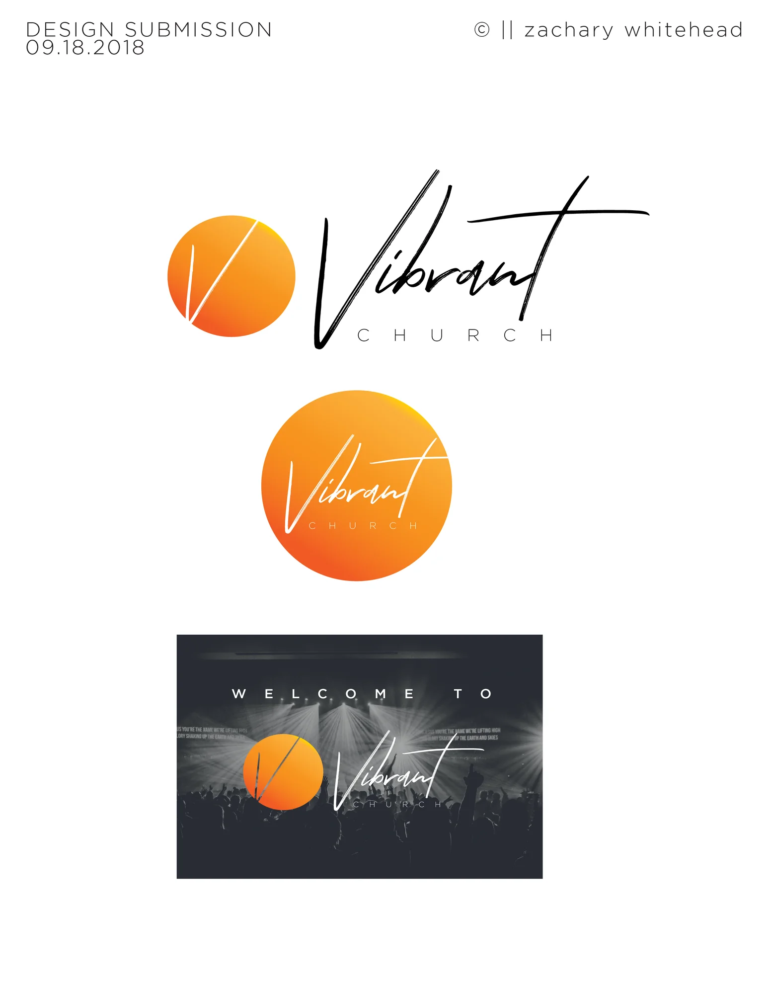
Vibrant Church
From vision to visual language.
Helping a church plant communicate who it was before the community knew its name.
THE CONNECTION
Before there was a church brand, there was a conversation.
Michael Scobey preached at the church where Zach was serving in Houma, Louisiana. They connected there. Later, when Michael and Carmen felt God leading them to plant a church in the Houston/Spring area, Michael reached back out and shared the vision.
They envisioned a life-giving, creative, enthusiastic, and loving church. Intergenerational and culturally diverse. Focused on families, serving locally and globally, and helping people discover their God-given purpose.
THE CHALLENGE
Give the vision a language people could recognize.
The task was larger than making a logo. A new church needed a visual and communication language that could carry its vision into the community.
The original strategic material expressed the philosophy clearly: “The Gospel never changes but the methods that we use to reach people do.” The identity and communications were energetic, colorful, and contemporary because that approach served the vision.
A vision becoming a shared experience.
- 01Vision
- 02Identity
- 03Launch
- 04Experience
- 05Message
- 06System
- 07Growth
- 08Handoff
THE LAUNCH
Make the first impression part of a larger story.
Brand development and early logo exploration established the foundation. Strategic and sponsorship materials helped communicate what the church was building. Launch marketing, direct mail, a website, and worship and guest materials carried that story outward.
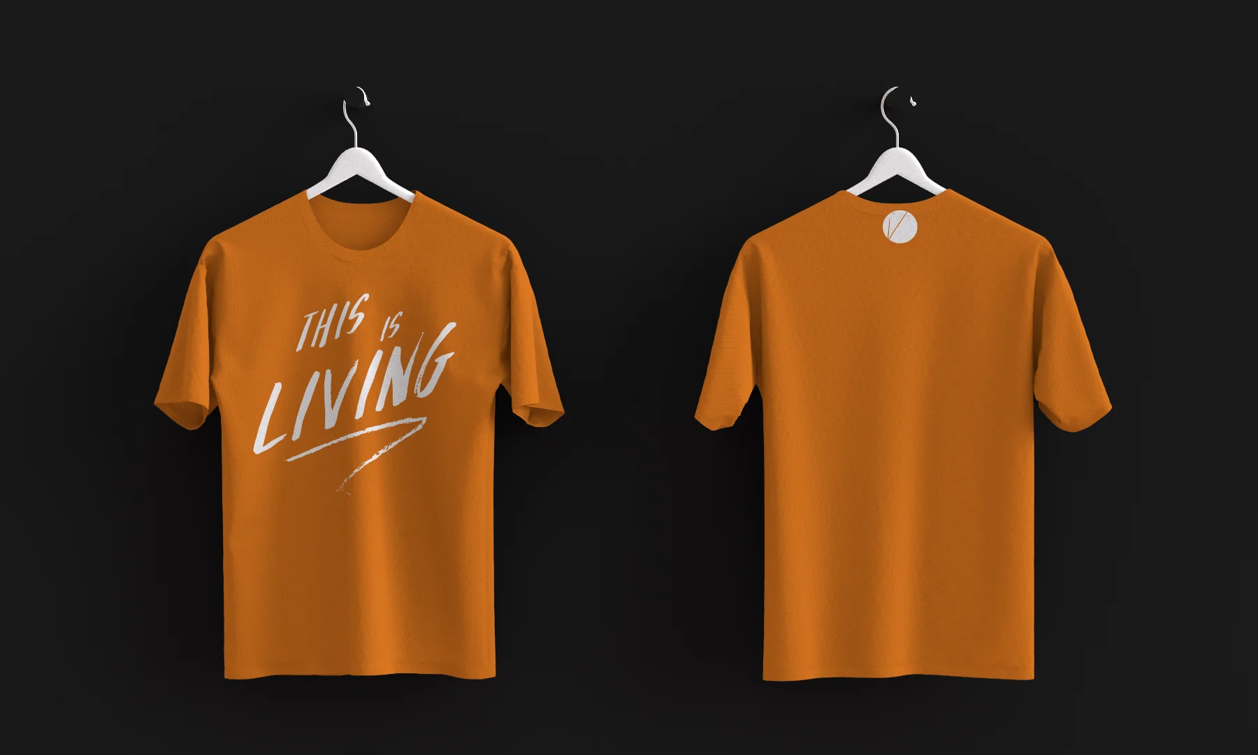
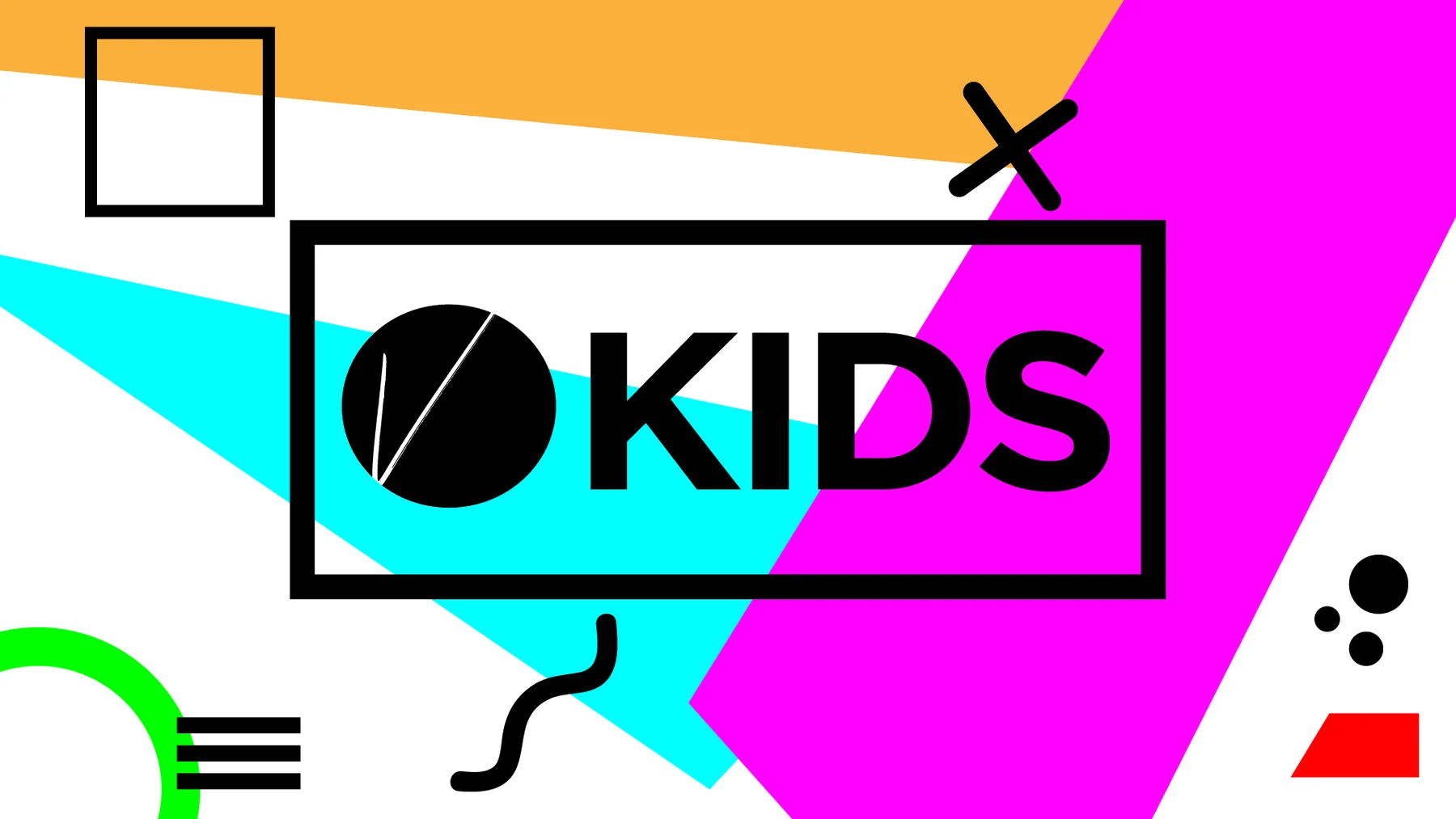
Vibrant Kids, apparel, event campaigns, sermon series creative, and motion bumpers extended the communication into the life of the church. Meraki continued supporting that work for several years.
AN IDENTITY THAT COULD EXTEND
MESSAGE BEFORE MEDIA.
Church communication isn’t decoration. The brand creates the framework; the message determines the visual language.
Consistency doesn’t mean sameness.
 01
01Breakthrough
Broken-chain and preparation imagery connected the creative to the message. The concept did more than place a sermon title on a graphic; it gave the idea a visual expression.
 02
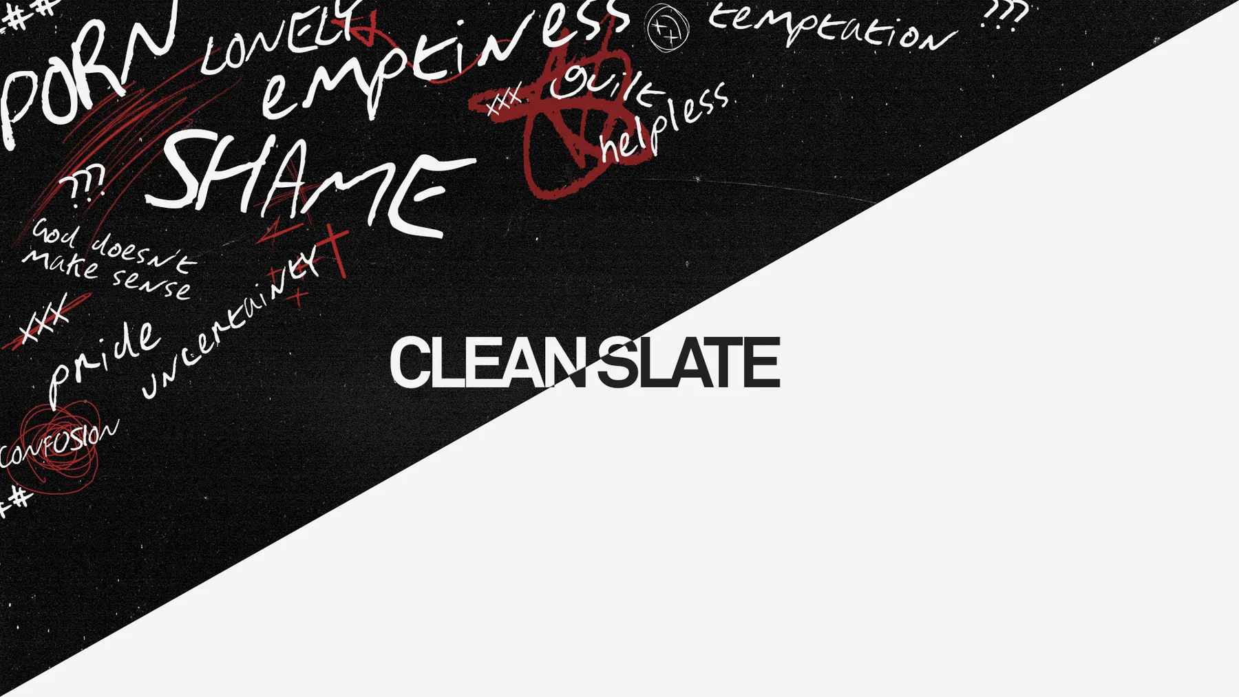
02Clean Slate
The contrast between chaos, shame, loneliness, pride, uncertainty, and a clean field communicated the central idea before explanatory copy was needed.
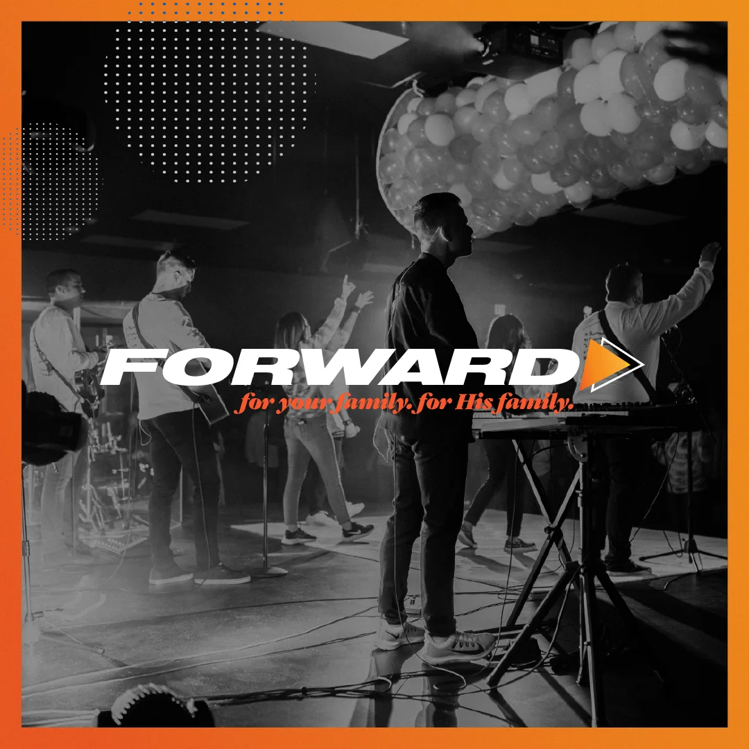 03
03Forward
A shared visual language extended across multiple pieces, making this a campaign system rather than a single graphic.
THREE YEARS LATER
The point of the branding was never the logo.
The early work began with an idea, a launch team, and an identity. By the three-year anniversary, the creative was full of real people, worship, baptisms, families, and shared history.
The communication now had a life together to reflect. The people were always the point.

THE HANDOFF
Help the church carry the work forward.
As Vibrant grew, a man joined the team who helped lead youth ministry and showed an aptitude for creative work. Zach worked with him to make a clean transition.
Meraki transferred branding, design assets, the website, and the systems and knowledge needed to continue locally. The goal was “no dropped ball”: give the person inside the church what he needed to carry the work forward.
The goal was never to be needed forever.
Vibrant developed its own creative capacity. Meraki helped hand the work to someone inside the church. That was the win.